Graphic Novel Roundtable: A Wrinkle in Time

Greetings, Nerdspan Nation! Welcome to the first edition of Nerdspan’s Graphic Novel Roundtable. Each month we’ll select a work to read and discuss, and for the inaugural column we’ve chosen Hope Larson’s adaptation of Madeline L’Engle’s classic Young Adult novel, A Wrinkle in Time. We hope you enjoy reading the discussion as much as we enjoyed having it! All of us would love to hear your opinions and your suggestions for future Roundtable selections, and we encourage you to leave all of the above in the comments section below. Your thoughts are what make exercises like this worthwhile, so please share them with us!
Our first selection was a divisive one, and Larson’s adaptation provoked some interesting thoughts from the Nerdspan crew. Be forewarned that this discussion contains some spoilers for those who’ve never read the book (and to you folks I say “what are you doing here? Get thee to a library!”). Now, without further ado, let’s talk turkey.
I’ve read A Wrinkle in Time several times before as a (much) younger man, and I consider it a powerful and deeply strange classic of YA literature. Given the strength of that source material I think Larson does a really admirable job here of basically getting out of the way of L’Engle’s words, picking the “right” things to dramatize, and not deviating from the text in any real substantive way.
That said, I think I appreciate this adaptation most as a kind of primer for kids who either aren’t ready to read the novel or who aren’t the type to read novels but would read a graphic novel. This is a matter of personal taste, not objective quality, but some of what’s really disturbing/wondrous/strange in L’Engle’s novel came off to me as softened and defanged in Larson’s adaptation. Her artwork is rounded and appealing and somewhat reminiscent of Craig Thompson’s work in Blankets, but I’m not sure that style entirely fits L’Engle’s tale. The novel itself is cosmic and wild, surprisingly creepy and somehow “unsafe” for its own characters. I feel like this interpretation, with this particular art style, doesn’t really succeed at matching what was in my head in that sense. What it does do (very) well is deliver L’Engle’s story in an appealing and accessible way, and that’s no small thing.
What did you think?
So I’m going to be the stick in the mud this time around and say that I didn’t really enjoy Larson’s adaptation of A Wrinkle in Time at all. My major issue was, strangely enough, with the art, like Morse brought up. Except I’m not going to be so kind as to say it’s at least accessible. While it is accessible, I feel that it comes at the expense of creating the right experience, and that’s a sacrifice that ruined the whole experience for me. While I remember reading the original as a kid and adoring it beyond belief, I couldn’t help but feel like Larson’s art was an intense let down. This isn’t just because it failed to meet my nostalgic standards, but because the wonderful thing about the original novel was the grandiosity of Meg’s experiences. The transformations, the different planets, the weirdness and richness, and terror of what she saw and was experiencing was entirely diluted with Larson’s monochromatic, cartoony style.
Now, this isn’t to say that Larson’s style isn’t good. She’s quite adept and has a lot of talent. I just do not think it was the right fit for A Wrinkle In Time. L’Engle’s novel is cosmic and grand and mind-bending and literally overwhelming, whereas Larson’s art is very safe, down to this earth, and cutesy, and the tone of it just jarred entirely with the tone of the book. For example, “Auntie Beast” felt straight out of a Dr. Seuss book, and didn’t inspire any feelings of strangeness, fear, or comfort. It was too comic, at a point in the story when things were at their bleakest (with Meg’s near-death and Charles Wallace being left behind). We want the fantastic escapism that Meg is undergoing in her attempts to deal with her father’s disappearance, and Larson’s art just fails to provide this. It doesn’t feel magical, it feels almost boring. And I think this does a great disservice to the story by making it more look more banal than it is.
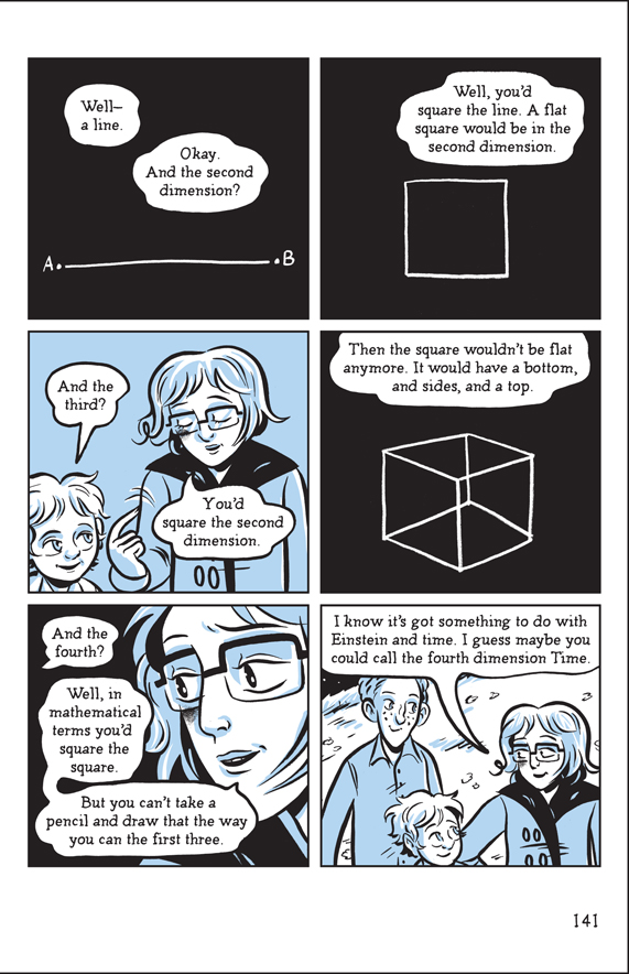
I first read A Wrinkle in Time when I was a child – maybe nine or ten years old – and then again in junior high school. I remember that it stayed with me in a way few books had up until then. I remember it for its powerful and fairly unique depiction of Evil: not as a villain but as a force. I remember the creepiness of the story, getting whisked away to strange worlds by beings you can scarcely comprehend and then abandoned there, left to fend for yourself against dark forces. I remember the pure Weirdness of it. Centaurs, stars that are also angels, two-dimensional worlds, possibly psychic children.
Hope Larson’s interpretation, while in no way perfect, certainly conveyed a lot of that. There was a sense of wonder and excitement and creepiness and weirdness that was very much in keeping with the original. There was also a charming simplicity to it, a sort of minimalism that kept things from getting too out of control. That being said, L’Engle’s story is so dense, so packed with imagery, it really seemed a shame to see it rendered in only shades of blue. This kind of story, like a Narnia or an Alice story, would have really benefitted from a Technicolor experience – sweeping landscapes and popping colors and two-page spreads. But, it did tell the story in a very simple, clear way without removing anything of importance, and ultimately that is the most important part.
I’ve read this book several times since 1979. Currently, I’m reading it to my daughter. We read the actual chapter first, and then go back and read the graphic novel version of the same chapter to reinforce what we’ve read. What I’ve noticed in this close reading of both versions of the book is that the structure is the same. Larson has taken L’Engle’s dialogue, which is the skeleton of the original plot, and hung her own adaptation upon it. In place of L’Engle’s descriptive language, we have Larson’s sequential art to fill out the narrative frame. The experience in reading each variation is not only similar, it is close to exact in terms of the dialogue.
I’m a fan of the original book, having travelled hundreds of miles to meet L’Engle at a literary convention. I’ve read not only this book’s sequels but also poems and essays by L’Engle. So I know a fan when I see one. Larson’s version reads as an ultimate fan edit–as veneration of the original text. In her Huffington Post article you can see that she enjoyed these books as much as we did.
My preference is for cartoony styles, so I am in favor of Larson’s art. Realistic styles were a novelty when I was a kid, but they bore me now. Will Eisner and Amanda Conner’s styles are about as realistic as I like comic book art to be. Larson’s style goes cartoony to the extreme, using what Scott McCloud called “masking,” or taking detail away from the face deliberately in order to promote reader identification. Meg isn’t as abstract as Tintin, but it is still a good example of masking.
I’ve read four chapters of the original and three chapters of the graphic novel so far to my daughter, and she likes both about equally. When we’re done for the night, she begs me to read more no matter which version we’re reading. It is like I am having a four dimensional experience with the book, reading it in two different versions, plus getting it through her eyes, and now discussing it here.
Mara Whiteside:
It’s been YEARS since I’ve read A Wrinkle in Time. For me, reading Larson’s book jogged my memory on a lot on the plot of the novel. The artwork didn’t distract me, but I will agree that it didn’t do the story justice.
There were a few things I did like about the artwork. I loved how she showed Meg’s frustration through wide eyes and close-ups. I also appreciated the emphasis she put on Meg’s need for closeness and human contact.
I read A Wrinkle in Time for the first and only time years ago when I was eight or so. It’s been over a decade, so my memory of some of the finer plot points were understandably a bit fuzzy. Larson’s adaptation seemed to keep with my memories of the plot and reminded me of some of the forgotten points. As with the adaptation of I Am Legend, the art filled in the gaps that the narration left open.
In this particular case, the art was there to fill the gaps, but it still left a lot wanting. Larson’s style is far from terrible, and is actually a fun style, but just doesn’t mesh with my mental images of the story. While any adaptation rarely lives up to what a fan has imagined, this story was told with such a grand, awe-inspiring scale that Larson’s simple art just doesn’t do it justice. It could just be the imaginings of a second grader versus the art as perceived by a twenty-something, but the visuals just weren’t on the scale on the story needed.
The one thing that I can applaud the graphic novel for is the great adaptation of the original work. It’s very close to what I remember and seems to follow the story well. That, along with the expressiveness of the characters through the simple art, were redeeming factors. Though, ultimately, I couldn’t help but feel let down. It’s a faithful adaptation done by an obvious fan, but the visuals just couldn’t keep up with the details of the story.
This book if nothing else is serving as a great refresher. Like most of you, I first read this in elementary school. I haven’t really experienced it since. No film or TV adaptations, nothing. I liked Hope Larson’s art in this adaptation. Her obvious love for the project came through in each panel to me. In the interest of full disclosure, I follow Larson on Twitter and have read about the care and effort involved in this project. Meg seemed much more identifiable to me this time around, whether blushing in her early interactions with Calvin or her self doubt when confronted with situations seemingly beyond her comprehension. There were definitely moments that could have used a more majestic, less cartoony touch but all in all, it worked for me.
Tesseraction!
MMorse:
Leo brought up the monochromatic coloring, and that might be my biggest issue with the art. A key plot point in the novel revolves around the fact that IT’s conquests all have eerie red eyes and that IT emits a murky red light – a section of this GN (and the novel) is even titled “The Man With Red Eyes”. It felt “off” to not see that brought to life here and it makes me wonder whether it may have been cost prohibitive to add more color, or whether it was a conscious artistic choice. Had the art been in color would that have changed your opinion of it?
On another note: the story itself has some interesting and sometimes subtle, sometimes blatant things to say about a variety of topics – conformity, individualism, scientific theory and religion. What spoke to you most and why?
Personally, I’d forgotten just how specifically religious/Christian this book is, and in a surprisingly overt way. Granted, that sense of religiosity is filtered through a really odd, inventive lens (centaurs with wings! disembodied brains! witches! theoretical physics!) What do you all think about this element in terms of the story itself? Was it distracting or off-putting?
I really like the color palette that Larson chose. I think the way the blues contrast with the blacks creates a really interesting effect. I do agree, though, that I wish some reds had been introduced once IT is introduced. Reading the book for hundreds of pages in three colors, and then out of the blue adding a fourth one on Camazotz, would’ve been pretty spectacular. I’ve read through a few interviews Larson gave about adapting the novel and I didn’t see any mention in any of those for why she chose the colors she did.
I read L’Engle’s novel for the first time about two weeks before I read Larson’s adaptation for the first time and at the time the religious aspects, when they were introduced, took me by surprise. It felt out of place in the world of the story up to that point, and I must admit that I rolled my eyes a little bit in an ‘Oh great, now the book’s going to try to save me’ sort of way. Once I got used to it as just another element of the story and the characters, though, it wasn’t distracting. I actually think the juxtaposition of fantastic alien creatures and worlds with references to the Bible and to traditional hymns is a really interesting aspect of the book.
Kaitlin Tremblay:
I think colour would have been a major help in making it feel like a more true/effective adaptation. The monochrome was my first problem with it. I can kind of see where the monochrome fits (trying to create a sense that despite the fantasy and the distance between these places, they’re all interconnected in an essential way), but I feel like this theme isn’t overt enough to justify the lack of important colouring. The sadness in the conformity at the end on Camazotz would have been so much more profound if contrasted with fantastical and brightly coloured planets and instances. The monochrome gave off too much of a constantly depressed tone, which worked in some places (like Camazotz and Meg’s early life), but failed in others, like with Uriel. To have a juxtaposition of colour and darkness would have made the “Dark Planets” so much more tangible and visceral if we could have felt the sadness and lack of vivacity in them through colouring.
That brings me to the topic of conformity, especially in relation to the religious aspects. I definitely was surprised at how overtly religious the book was. For the most part, while I found the praying and elongated religious passages at odds with the text, they didn’t come up often enough to become overbearing (and this is said as an atheist who tends to avoid overtly religious works). They were distracting (for me at least) when they were there but then they were easily forgotten as soon as you moved on to the next panel. And I think the theme of conformity, and Meg embracing herself for all her perceived faults, was more overwhelming and poignant than the odd instances of prayer. Also, the fact that Meg uses her anger and hatred to help achieve her goal in the end speaks to a level of distance from too much religious proselytizing (my experiences of Catholicism were always to suppress our anger in favour of love and patience). The story vouches for free will (and the right to make bad decisions, so long as they’re your decisions) seems to defy the idea of following a certain sect blindly without having evaluated it for yourself.
This isn’t to compare religion to IT, but to say that the book belongs more to the “act for yourself” camp, than following rules because they’re from a sacred authority. I guess, ultimately the religious parts just felt more of coming from a certain authorial mental framework, rather than any theme or agenda of the story.
I will admit, though, I did find it odd that the ultimate villain was a giant brain, which became symbolic for blind conformity, when it’s Meg and Charles Wallace’s unique brains (their ways of thinking and digesting information) that set them apart from others in their grades. And I suppose then the reductive implication that “brains don’t have love” does to a certain extent belittle the sciences — especially considering the whole act of tessering is using and then exploding our concept of physics and travel in a “leap of faith” kind of way (you can’t explain it, you just get it/understand it/accept it). But is this Larson’s or L’Engle’s implications?
MMorse:
I may be wrong, Kaitlin, but I’m fairly certain that Meg’s anger/hate ends up being a trap for her – something that IT can use to help take control of her. It’s when she takes a page from Luke Skywalker and lets go of her anger that she’s able to see a way to help Charles. As for your question, I’m not sure that either Larson or L’Engle is belittling the sciences so much as they’re making a point about how cold logic devoid of love can lead to horrific things.

It was a dark and stormy and monochromatically blue night.
Keith Hendricks:
I wouldn’t be surprised if the decision to make the adaptation monochrome was the publisher’s, as this is a big graphic novel and they were probably trying to hit a reasonable price point. That being said, I didn’t really miss the color red. This is probably due to being a little older, and coming from a time when most (read as nearly all) quality independent comic books were black and white (Bone, Elfquest, Cerebus). Not that I want to start sounding like Drunk Uncle…(“Way back when I was collecting comics, we walked all the way to the comic book store and the best comics didn’t even have color!”).
As to the religious content, I don’t know that there is any “religious” content In this book, as so many religions attacked her and banned this book. From 1990-2000, the American Library Association lists this as #23 of the 100 most challenged books. And even from 2001-2010, it is still #90 out of 100. Just making it on that list with tens of thousands of books in circulation at any given moment, is a mark of notoriety. These critics, like the right-winged fundamentalist Jerry Falwell Association, also noticed the pagan-formed centaur angels, the witches, the heretical dualism of light and darkness, but their main complaint was Jesus being lumped in with artists, philosophers, and scientists. So if there is any religion in this book, it is some kind of personal deism of L’Engle’s that many dogmatic religious people are offended by. Does her free thinking bothet me? No. Am I bothered by some Bible quotes or the traditional fantasy paradigm of good vs. evil? No.
Ian Menard:
The monochromatic scheme was definitely my biggest problem with the book. While it more or less worked on Earth and Camazotz, I would have loved to see more color on Uriel and Ixchel rendered in full color – like Dorothy stepping into Oz. There is so much potential in the story. What if Camazotz had been rendered in pure black and white to highlight the conformity of the population? And then to have that punctuated with red eyes? That could have been striking. To have had Earth shown in fewer colors could have been a subtle cue to its partial influence from The Black Thing. And then, when we get to Uriel and Ixchel, to have a full, vibrant color palette, portraying a world free from this evil, inhabited by angels? It could have been phenomenal.
I had also forgotten how overt the Christian themes were, and at first they were a little jarring. That being said, I really enjoyed them. Of course, I’m coming from a fairly religious perspective, so I know not everyone shares my views. But I really enjoy seeing Christianity paired with science – because they don’t have to be mutually exclusive. To that end, it kind of reminded me of C.S. Lewis’ space trilogy. For those not familiar with the series, the first book is on Mars, the second on Venus, and the third on Earth. There’s space travel, aliens, Greek gods (which are really our corrupted understanding of angels), demons, and – at one point – Merlin. It’s bizarre, and flawed, but at times very powerful. Like A Wrinkle in Time it extrapolates what God’s provision looks like on other worlds, as well as how the Devil attacked them. I enjoyed the idea that the stars are really angels (or is it vice-versa?), that Evil is a cosmic cloud, and all the rest.
But at the end of the end of the day, the message isn’t purely Christian – it relates to everyone. It’s a simple message we’ve heard countless times but nonetheless is true: love conquers all. Calvin might be the next stage of human evolution with a gift for communication, but even he can’t compete with the power of an ordinary girl’s love for her brother. And ultimately neither can Pure Evil itself.
Leo Johnson:
As with basically everyone, the monochromatic coloring was a big problem. With my only imaginings of the book being through an eight-year old’s mind, the images had a lot to live up to. And the blue/black/white just didn’t do it. I’ve seen other comics and webcomics do it in wonderful ways, but this story just needed more majesty and wonder.
I, too, wouldn’t be surprised if the lack of color was the publisher’s decision. On the other hand, I imagine working with blue as the only real color was also much easier than using varied colors. Whether it was to save time or money or an artistic decision, I still think it might not have been the best idea.
As for the religious aspect, I was raised, live, and have lived most of my life in the Deep South, so I’m very familiar with religion and was raised in a religious family. Even though I’m now an atheist, religious stories and religious terms are strong symbols for most of the world. Whether it’s a Greek myth or a Christian parable, the story itself has a lot of power and meaning to people. The use of them often helps to convey messages in many books. Because of my exposure to religion, both Christian and the myths and beliefs of other belief systems, I was never jarred by the use of it in the book or the graphic novel. Like the Chronicles of Narnia, another childhood favorite, A Wrinkle in Time uses the passages and parallels in such a way that they serve their purpose, but never alienate.
The idea of individuality presented in the book always intrigued me. Upon my first read as a nerdy second grader, it was something that was on my mind. Whether to fit in or just be myself was always a question when it came to social situations. As an adult, it’s still something that is often on my mind. Though, it’s now become a reason to take chances rather than “be myself”. A Wrinkle in Time spoke for this idea of free will and making decisions, whether bad or good, which is something that can never be spoken for enough.
MMorse:
I was struck this time around as well by the references and allusions to literary, philosophical and scientific work in L’Engle’s story. The one that stood out most to me was L’Engle’s tying of Mrs. Who, Mrs. Whatsit and Mrs. Which to Macbeth‘s three witches and to the mythological Fates – Clothos, Atropos and Lachesis. L’Engle does this with her text, and Larson seems to point up that connection some with her art.
Mara Whiteside:
This may be a product of going to a Christian college, but the religious elements of a Wrinkle in Time hardly registered with me. Yes it was noticeable, but it wasn’t over-the-top.
Usually, I find stories that connect to some sort of previous literature (be it religion or Jung’s archetypes) have more opportunities to connect with readers and other texts than stories that try to be 100% unique. If offers something familiar to latch on to, regardless of whether or not the reader agrees with the content. L’Engle’s use of religious elements (and Shakespearean, when it comes to the witches) enhances the story.
Leo Johnson:
The Fates/Norns/Witches allusion was the most obvious reference in the book to me. The number three and the trinity is a common symbol itself, but the Fates allusion is used in many works. I think this was something I caught when I originally read the book as I was discovering Greek mythology just before reading A Wrinkle in Time. The way in which the text and art seem to allude to it just makes it a bit more apparent.
MMorse:
Speaking for myself, I’m glad I read this. It was nice to revisit L’Engle’s story with new (sigh…older) eyes, and this is an extremely faithful adaptation of that story, so points for that! I was let down some by the art and mostly the choice to go with a duo-tone coloring look, and while it seems as though many of you agree with that there are also a few of you who are just fine with it. I like that. And I like the reasons given, on both sides. I was going to say that “I’d give this book to my friend’s daughter,” but on further reflection I don’t think that’s true – yet. I think I’ll get my friend’s (amazing) young girl a copy of the novel first. Then, once she’s had a chance to read it and stew on it and hopefully fall in love with it, I’ll give her Larson’s adaptation. And we’ll talk about it, the way we’ve talked here.
Mara Whiteside:
I surprisingly loved this adaptation. After letting it sink in for about a week, I found that I enjoyed it more than I originally thought. Whether its the nostalgia factor or that I’m a sucker for graphic novel adaptations, I was satisfied with this graphic novel. Sure, it had its flaws. All works do. But I would be happy to recommend it to other L’Engle fans, including middle school students.
Side note – I got my copy from my local library, tucked away in the children’s graphic novel section. Can’t tell you how ecstatic that makes me.
Leo Johnson:
While it certainly didn’t live up to my expectations, it wasn’t terrible. It was a very faithful adaptation as far as the text went, with only the art failing to live up to my expectations. It was a great refresher though since I read the book a dozen years ago.
I would recommend it to fans of the book, as, even though it’s not perfect, true fans like seeing a work built upon and transformed in inventive ways. I actually look forward to reading this with my two nephews. They’re only three now, but in a couple of years, I would like to sit down with them and work through the graphic novel and later introduce them to the book.
Keith Hendricks:
I enjoyed it as a revisit to the original novel and I also admired it as a good example of a faithful graphic novel adaptation. My favorite graphic novel adaptation is probably still Phil Foglio’s version of Myth Adventures but this is somewhere in my top ten adaptations for sure.
Kaitlin Tremblay:
I’m still mixed on my final feelings for it. I would recommend it for someone who has already read the book (because it is a faithful narrative adaptation, even if I feel that the art does do a great disservice to the work as a whole and while i know I have a particular art style I enjoy, others will favour an aesthetic I don’t), but I wouldn’t recommend it for anybody who hasn’t already read the original. While it is certainly magical in and of itself, the original contains more depth and more magic that I feel we necessarily bring to our reading of the adaptation, and my worry would be that if someone who isn’t already familiar with the work would feel unfulfilled.
Ian Menard:
Ultimately, this was not the adaptation I was hoping for. I found the art to be overly-simplistic and the color palette lacking. That being said, I found the story clear and easy to follow. It seems as though this would serve best as a refresher for someone who hasn’t read the book in a while, or perhaps right after reading the original. I’m not convinced that it would inspire anyone to read the novel, but it serves as a decent adaptation of a compelling story.
R.C. Schmidt:
I enjoyed the book, along the lines of what Ian said, it worked really well as a refresher since I hadn’t read it since elementary school which was a long time ago, we’ll say. As an experiment of sorts, I’ve left the book out on the coffee tables throughout our home and slowly but surely, each of our kids save for the 4 year old have picked up the book and at least flipped through. I think what is not being touched upon is they are the target audience, not us. I enjoyed it, appreciated the art and saw first hand the book succeed in its aim: Make the book accessible for kids.
As for the color scheme, we had wondered about stylistic choices or budgetary concerns. Turns out it was a bit of both. I asked Hope Larson about the reasoning behind the blue palette and here is her response: “We didn’t have the budget for color because the book was so long, and blue is always a safe neutral choice for a spot.”
Joe Grunenwald:
Larson’s work stands alone and tells a complete story, but overall I think the book works best as a supplement to L’Engle’s original novel. There were points where the art didn’t quite align with what I’d imagine reading the novel, but that’s the danger with any adaptation of a novel, I think. As far as the art style/color, I obviously didn’t have the problem with the art that others did. It would’ve been great to see in full color, but I still very much enjoyed the blue and the different effects that it created.
I wonder, do you guys think it would’ve been better had there been no color at all and it was just black and white? Was the blue a tease?
As I think I said originally in my review, I think this GN would be a great ‘gateway’ book to get someone into comics, though, again, it would probably be most effective if the person has already read L’Engle’s novel.
___________________________________________
That’s all, folks! We’d love to hear your thoughts, opinions, and suggestions below. Thanks for reading!